Is there really a Problem?
The checkout process is a critical touchpoint in the user journey, yet many online stores struggle with high cart abandonment rates due to friction, confusion, or lack of trust. Customers often face issues such as complex form fields, unexpected costs, limited payment options, or slow performance, leading to frustration and lost sales.
This case study explores how optimizing the checkout experience through streamlined design, clear communication, and seamless payment integration can improve conversion rates, enhance user satisfaction, and drive business growth.
Responsibilities
Discovery, Visual & Product Design, UX Research, Product Strategy, Systems Design
Industry
Financial Technology (Fintech)
Role
I spearheaded the overall design for the checkout flow for Ercaspay. I led the design, research, and strategy of the entire project. Facilitated cross-team collaborations with key stakeholders - developers, QA testers, consultants etc.,
This helped us refine the product and made it market fit for the soft launch in 2024.
Payment as a solution
Digital payments have transformed our economy, shifting from cash reliance to digital freedom and unlocking vast possibilities for businesses and consumers alike. According to Globaldata,
“The annual value of card transactions in the Nigerian cards and payments market will be $147.7 billion in 2024. The market will grow at a CAGR of more than 22% from 2024 to 2028.” With this growth, it is therefore important for every business to enable digital payments. However, this is not without its challenges —cybercrime threatens security while customer hesitation slows adoption. In Nigeria specifically, international purchases are hindered by transaction limits and limited card acceptance by global payment gateways. Merchants often rely on alternative systems like bureau de change or FX accounts. While payments appear decentralized globally, Africa faces a different reality. —a disparity that reveals precisely why Ercaspay matters and why we must fundamentally reimagine payment solutions.
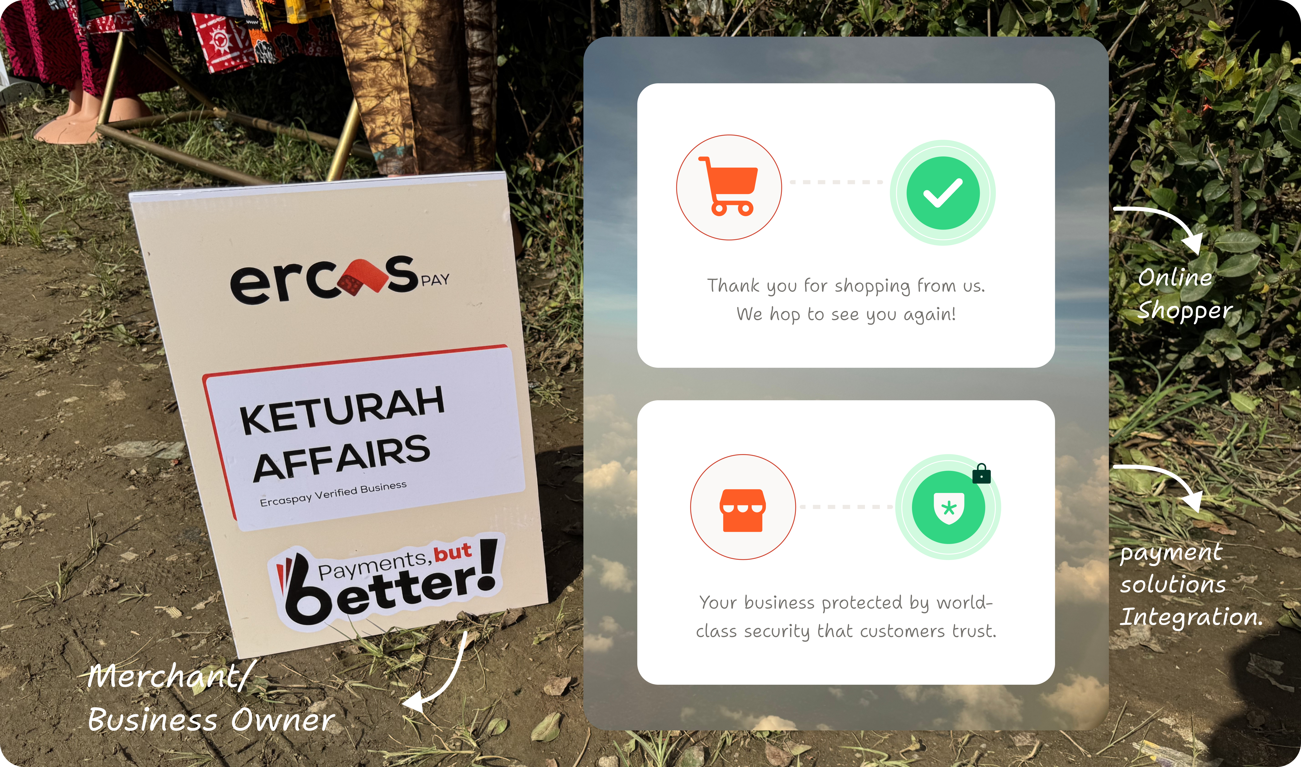 An ErcasPay's Merchant displaying her product at a Tradefair
Checkout Delivery Process
Early on in the project, I discovered that a great checkout experience isn’t just about aesthetics. It’s about trust, ease, and efficiency. But getting from a well-crafted design to a fully functional product takes careful planning, collaboration, and iteration. Here is a summarized process workflow that made execution easy and helped us achieve product success.
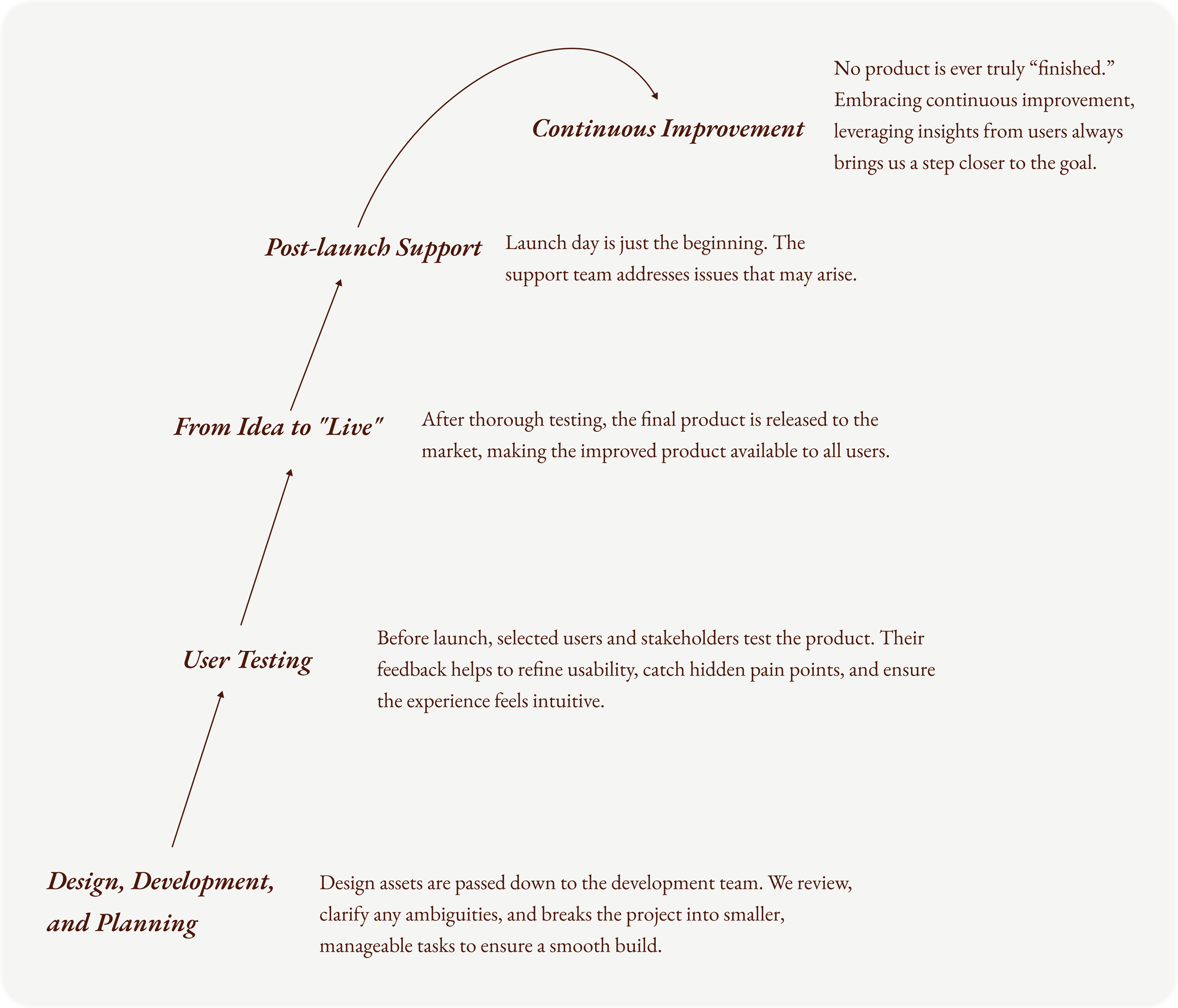 An illustration of the Product Delivery Process
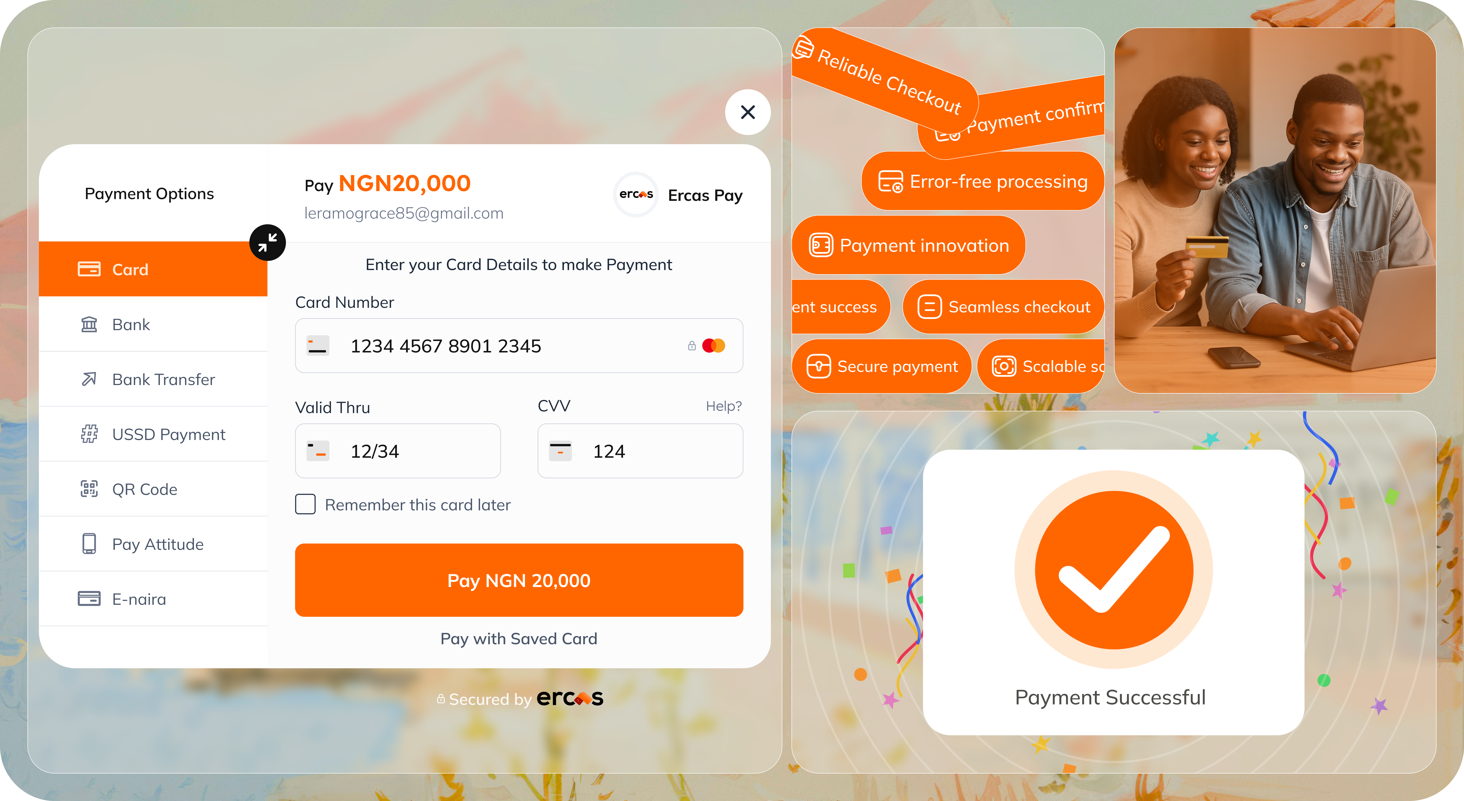
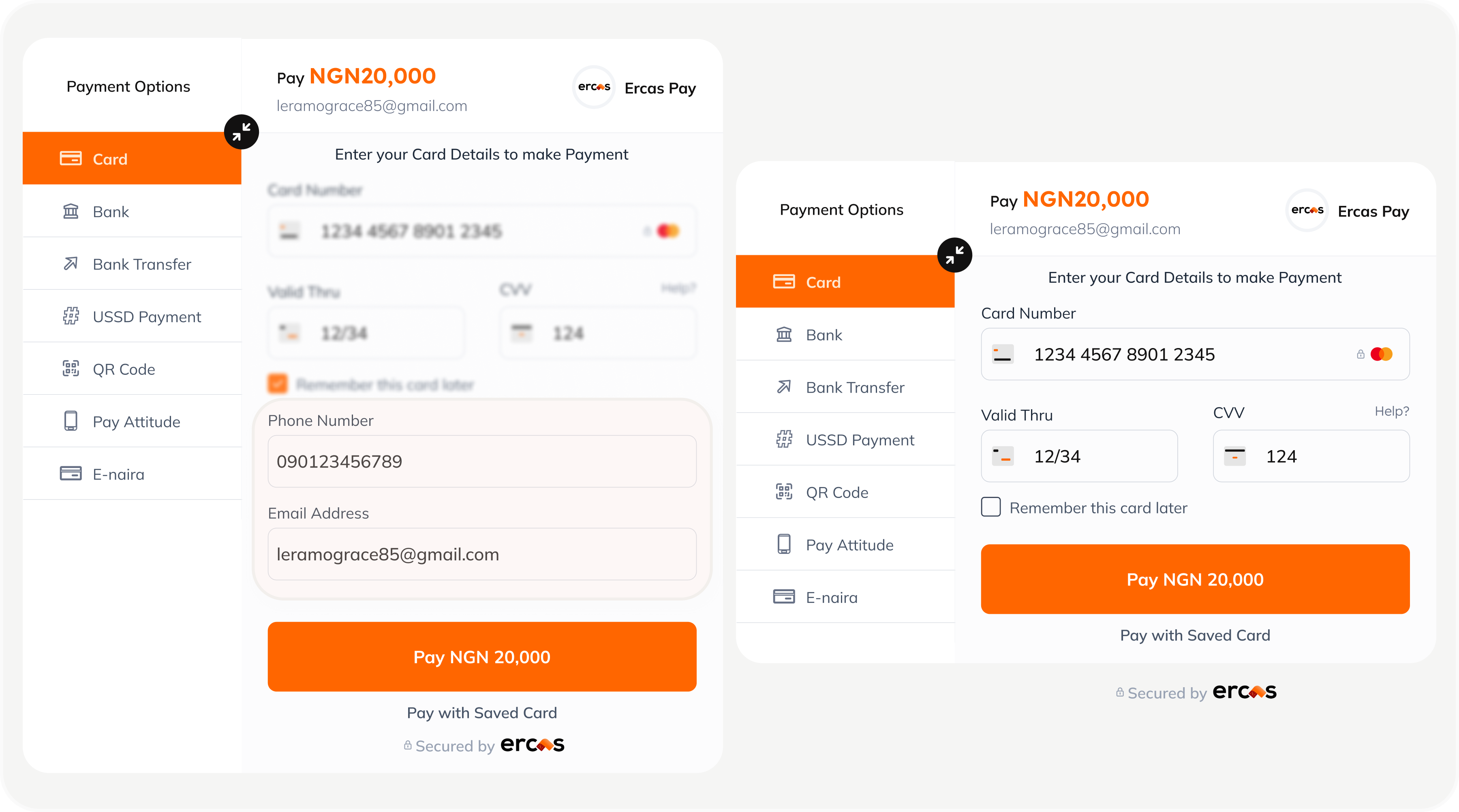
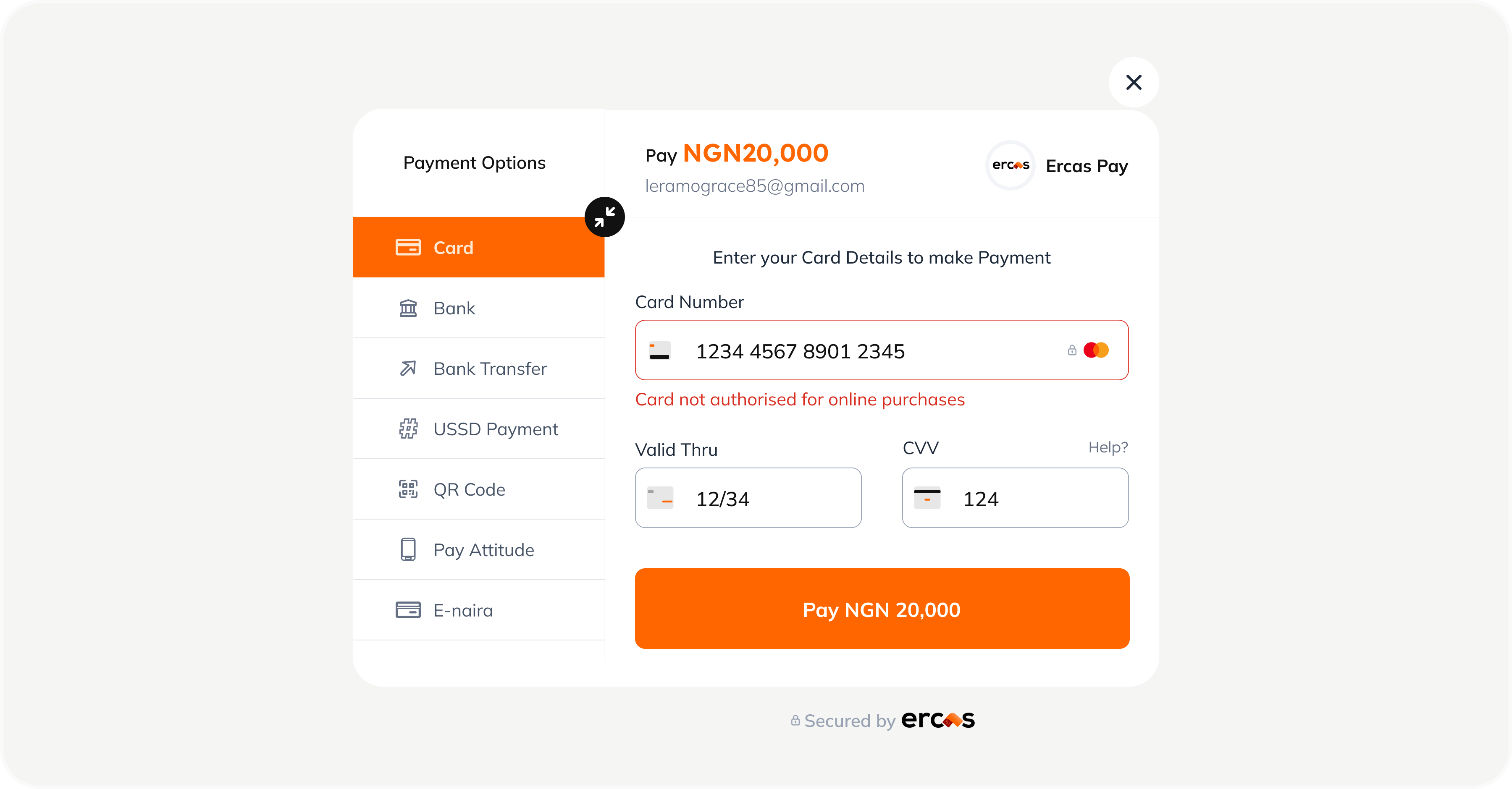
Streamlining Card Details and Collection
Users are required to enter their card details to complete a payment but how they get to that point can vary. Depending on the merchant or industry, the process of collecting customer information happens through different channels and platforms. Regardless of how a user arrives, the goal is the same: collect their card information and process the payment as smoothly as possible. To make this easier and faster for returning users, we ask for their phone number and email address so they don’t have to input their card details every single time. This small step saves time, reduces friction, and builds a more personalized checkout experience that feels effortless, especially for users who return frequently.
 An ErcasPay's Merchant displaying her product at a Tradefair
Behind the Scenes of a Secure Checkout
A smooth payment experience isn’t just about clicking “Pay Now”. It’s about security, accuracy, and real-time coordination between multiple systems. It’s important to understand how the checkout flow works. So, I decided to create a visual summarizing the flow from merchant dashboard to “payment successful”
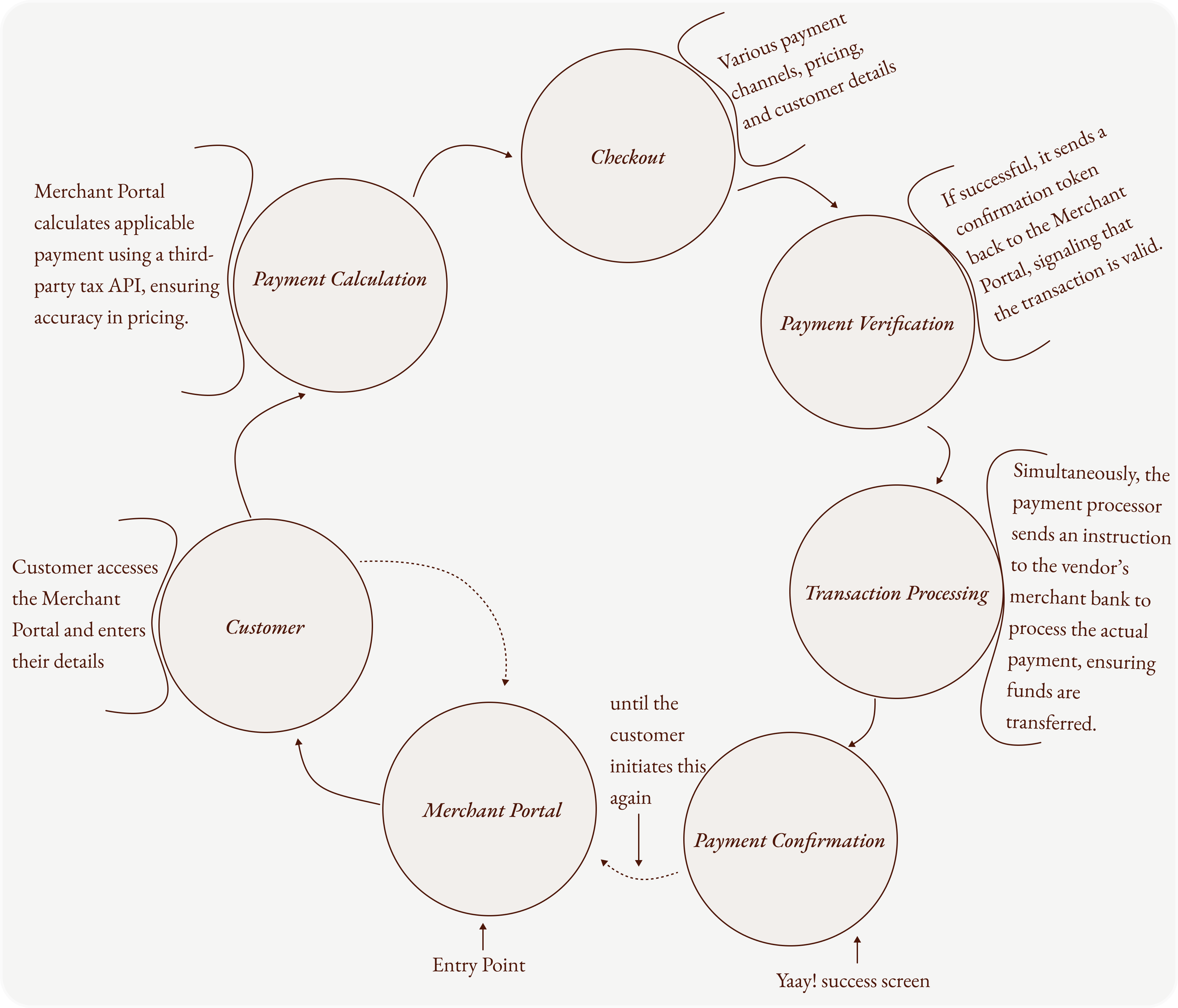 Checkout Process Flow
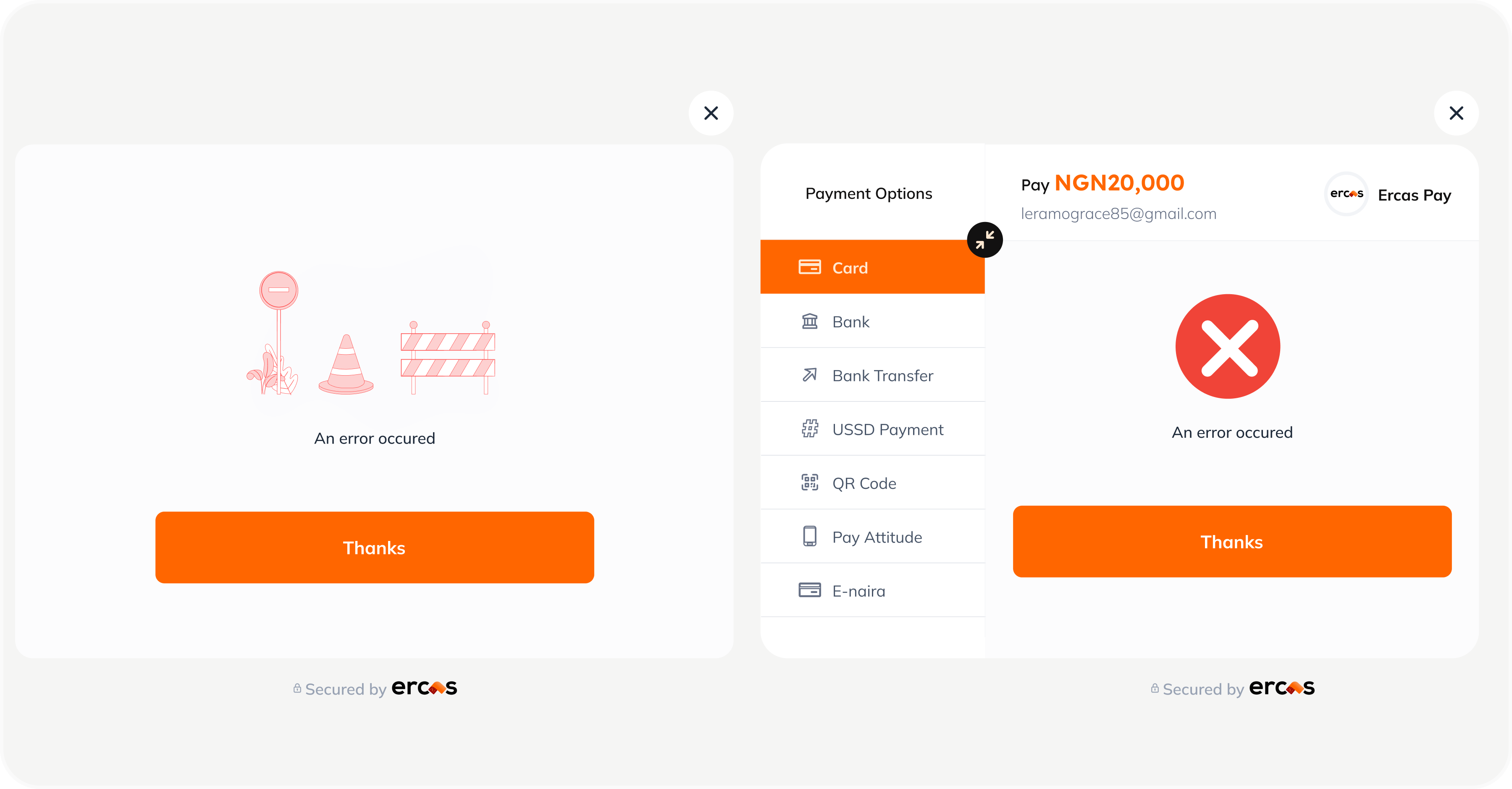
Errors Are Human—Design Should Be Too
Everyone makes mistakes and that’s okay. It’s not about eliminating human error, it’s about designing systems that meet users where they are, especially when things go wrong. One of the core usability heuristics reminds us to “help users recognize, diagnose, and recover from errors.” This principle shaped how we approached error handling in the ErcasPay checkout experience. Instead of punishing mistakes, the system supports users by clearly identifying what went wrong, guiding them to the solution, and giving them the confidence to continue without friction or fear.
 Visual flow for onboarding pathway
From Confusion to Clarity
We never want to lose our users especially not in moments of confusion. That’s why it’s critical to keep them informed every step of the way. Visibility of system status is more than just a UX principle; it’s a way to build trust. I designed clear feedback states and error handling patterns to ensure users are aware of what is happening whether something is processing, succeeded, or went wrong. I understand that no system is perfect. and errors are inevitable whether they stem from the user, the merchant, or the server. But how we choose to handle them makes all the difference. Great products don’t avoid mistakes they guide users through them gracefully.
 An ErcasPay's Merchant displaying her product at a Tradefair
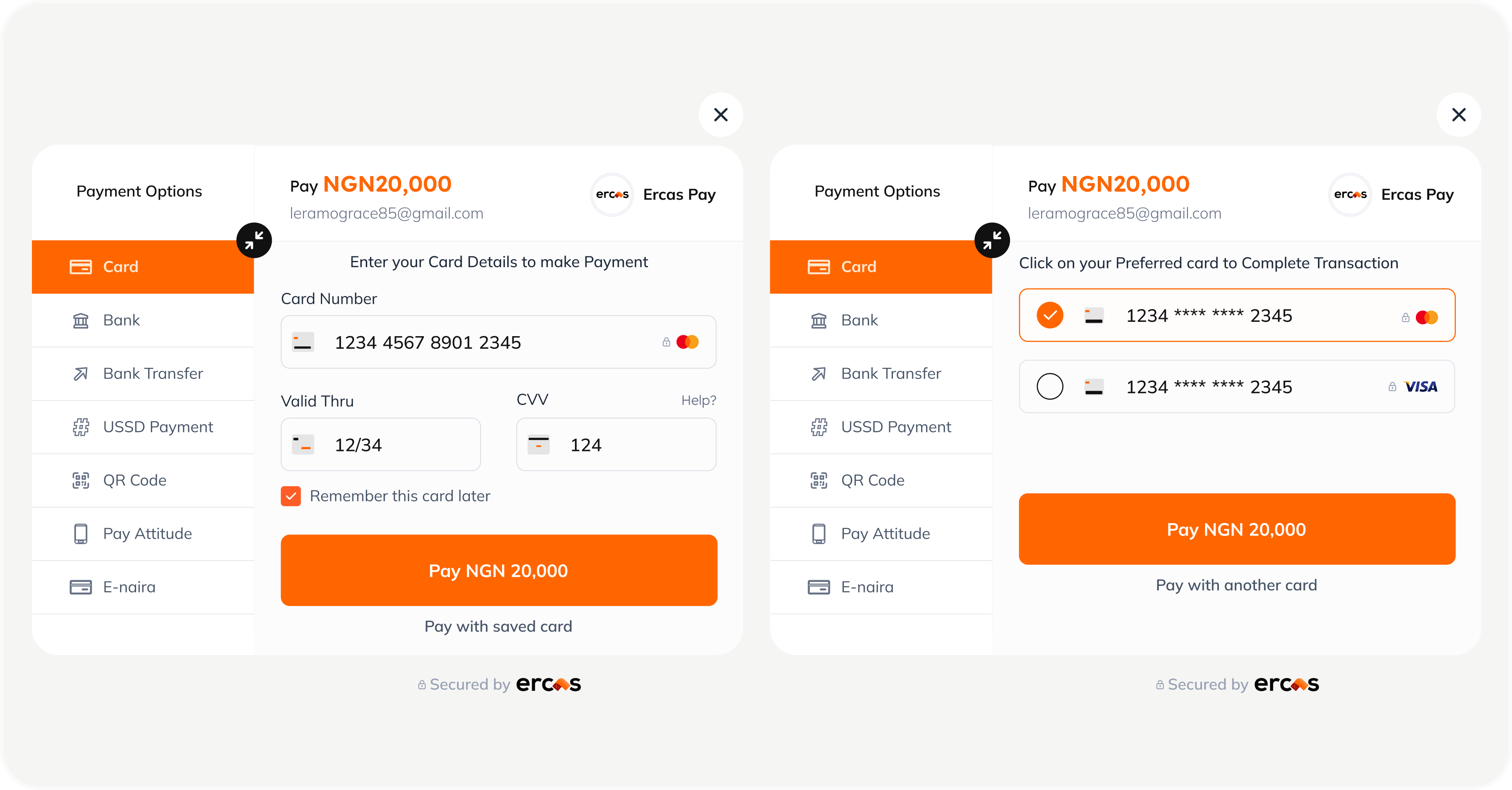
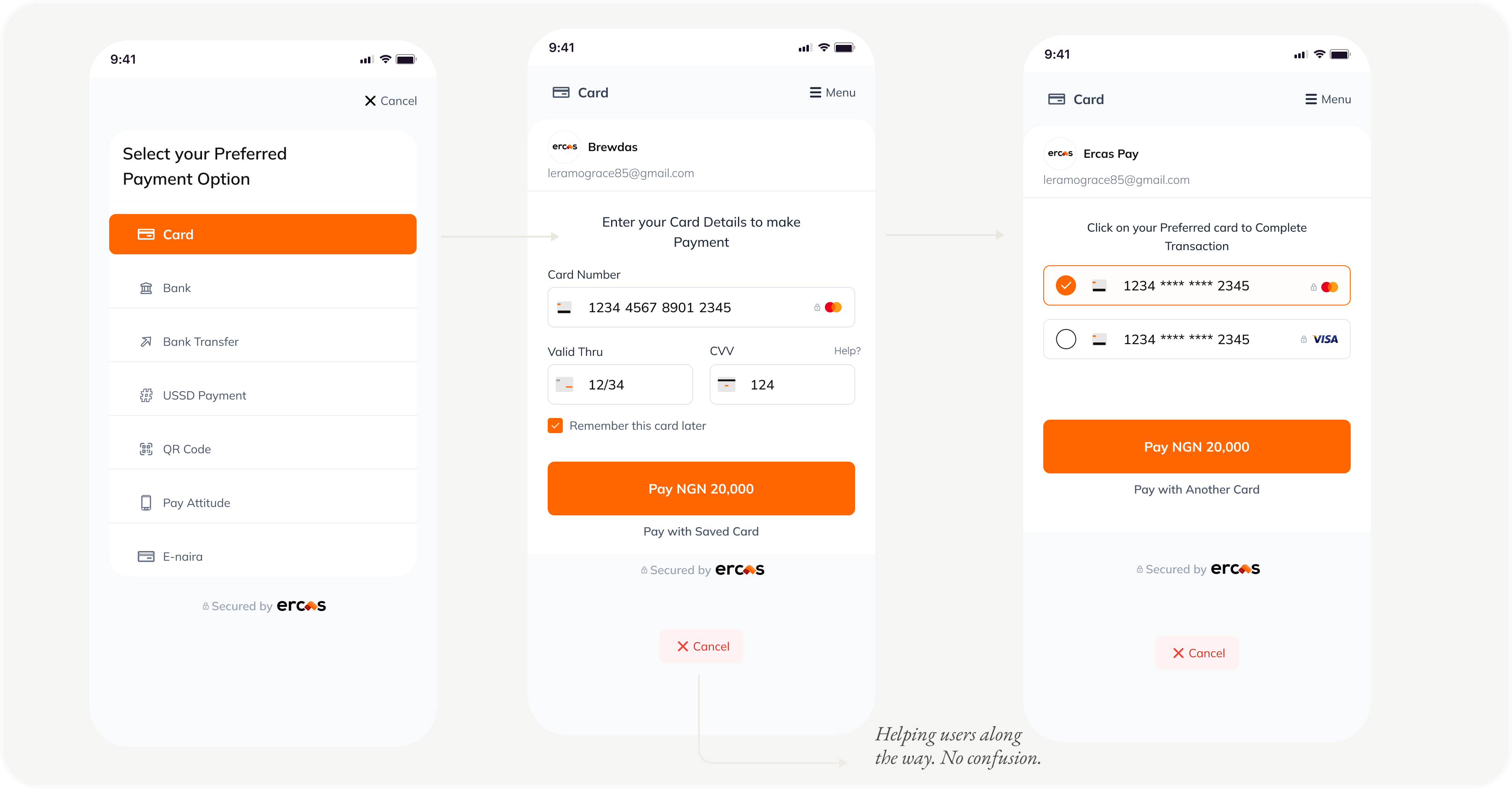
Why Familiarity Wins: Designing for Returning Users
At the heart of this product lies a simple but powerful goal: to empower our merchants by creating a checkout experience that feels effortless for their customers. We leaned into the principle of recognition over recall—designing the card payment flow in a way that helps users act quickly without having to remember or re-enter information. When a customer returns to make another payment, their previously saved card details are right there, if they had given us the permission to save it. They can simply select an existing card or choose to enter new details if they prefer. This small detail eliminates friction and enhances trust, making the checkout experience not just faster but smarter.
 An ErcasPay's Merchant displaying her product at a Tradefair
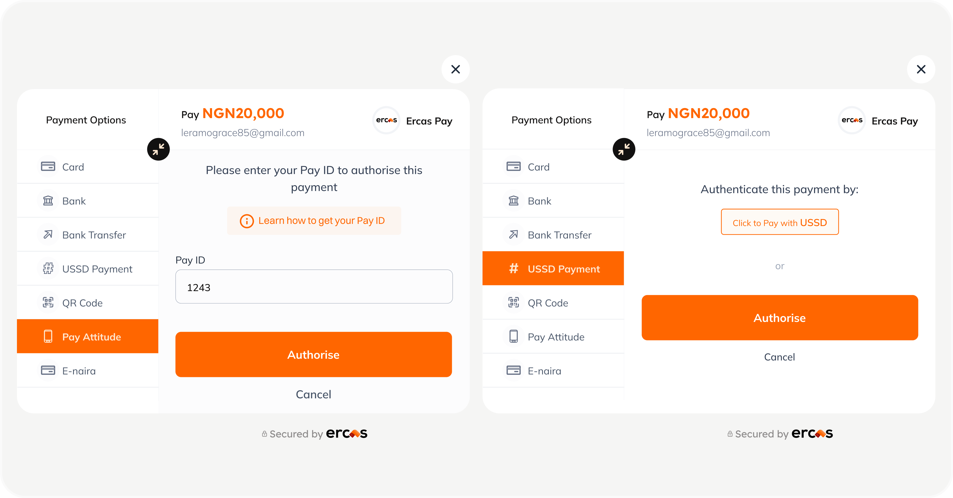
Empowering Users Through Micro-Tutorials
Our approach was simple: “communicate clearly to prevent errors before they happen”. Error prevention is at the heart of ErcasPay’s checkout experience. The flow is designed to guide users smoothly, helping them avoid mistakes and gently correcting them when they occur. Think of it like a child learning to walk: when they stumble, a parent doesn’t scold, they guide, comfort, and clear the path ahead. That is exactly what we aimed for. One example is the “Learn how to get your Pay ID” tutorial. A short, friendly guide that introduces users to one of the available payment options. It is not just informative; it empowers users to learn and confidently choose the method that works best for them.
 An ErcasPay's Merchant displaying her product at a Tradefair
Design Works When It Speaks the User’s Language.
Designing for adaptability isn’t just about responsiveness—it’s about relevance. My goal was to create an experience that feels native across devices, whether a user is on mobile, tablet, or desktop. But responsiveness alone isn’t enough. According to the heuristic principle “match between system and the real world”,the interface must speak the user’s language. That means using familiar words, phrases, and concepts that reflect how people naturally think and talk—not technical jargon. By combining visual adaptability with linguistic clarity, we designed a system that not only looks right everywhere but feels right too.
 An ErcasPay's Merchant displaying her product at a Tradefair
Designing for Impact Beyond the Job
As mentioned earlier, no product is ever truly “finished.” The best products evolve—refined by real-world use and shaped by ongoing feedback. Embracing continuous improvement means listening, learning, and iterating with purpose. ErcasPay officially launched in 2024 and even made headlines. Although I had moved on from the company before the public release, the foundation we laid through research, design, and cross-functional collaboration helped bring the product to life. It’s a reminder that thoughtful design leaves a lasting impact—even after you’ve stepped away.